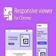
Streamline Your Responsive Testing Process with Responsive Viewer For Chrome
The Responsive Viewer for Chrome is a valuable tool for front-end developers, designed to simplify the testing of responsive websites and applications. This extension allows users to view multiple screens simultaneously, making it easier to assess and fine-tune layouts for different devices. With Responsive Viewer for Chrome, developers can streamline their responsive testing process, saving time and effort.
Top Recommended Alternative
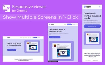
One of the key features of this extension is the ability to display multiple screens in one view. This allows developers to easily assess the responsiveness of their websites or applications across various devices. By customizing the screen sizes and orientations, users can simulate different screen configurations and resolutions, making it easier to identify and address responsiveness issues.
To use Responsive Viewer for Chrome, simply install the extension from the Chrome Web Store. Once installed, open the website or application you want to test and click on the extension icon in the Chrome toolbar. From there, you can customize the screen sizes and orientations according to your testing requirements.
Overall, Responsive Viewer for Chrome is a powerful extension that enhances the development workflow for front-end developers. By providing a streamlined and efficient way to test and optimize website layouts, this extension helps ensure seamless user experiences. Install Responsive Viewer for Chrome now and take your responsive testing process to the next level.